I am new to Infinity and really like the concept of bulking together Notion, Airtable, Google Forms, Trello, etc. into one organism.
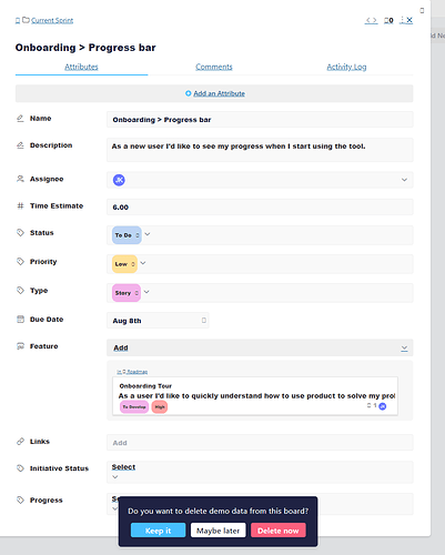
That said, I appear to have a weird font thing happening for me in the database which makes it less UX-friendly. It seems like my pages aren’t properly loading (I have a Surface Book 2 running on Chrome and use a Google Wifi setup. I don’t have this issue on other apps and pages).
I also find it takes time for the page to load (already the little “hourglass” infinity symbol is grating on me - why do we need to see a catchy slogan for each page change? It’s a bit clunky.)
I digress 
Any ideas why? Anyone else experience this? Bueller? Thanks!
Jenny

 At the moment, the only workaround solution is using another browser. We hope this will not be too much trouble.