Hi,
I do prefer to modified any task on lightbox rather on sidebar like in Trello and ora.
Much easier to edit plus on sidebar I didn’t notice if there any changes if I click any task.
Hi,
I do prefer to modified any task on lightbox rather on sidebar like in Trello and ora.
Much easier to edit plus on sidebar I didn’t notice if there any changes if I click any task.
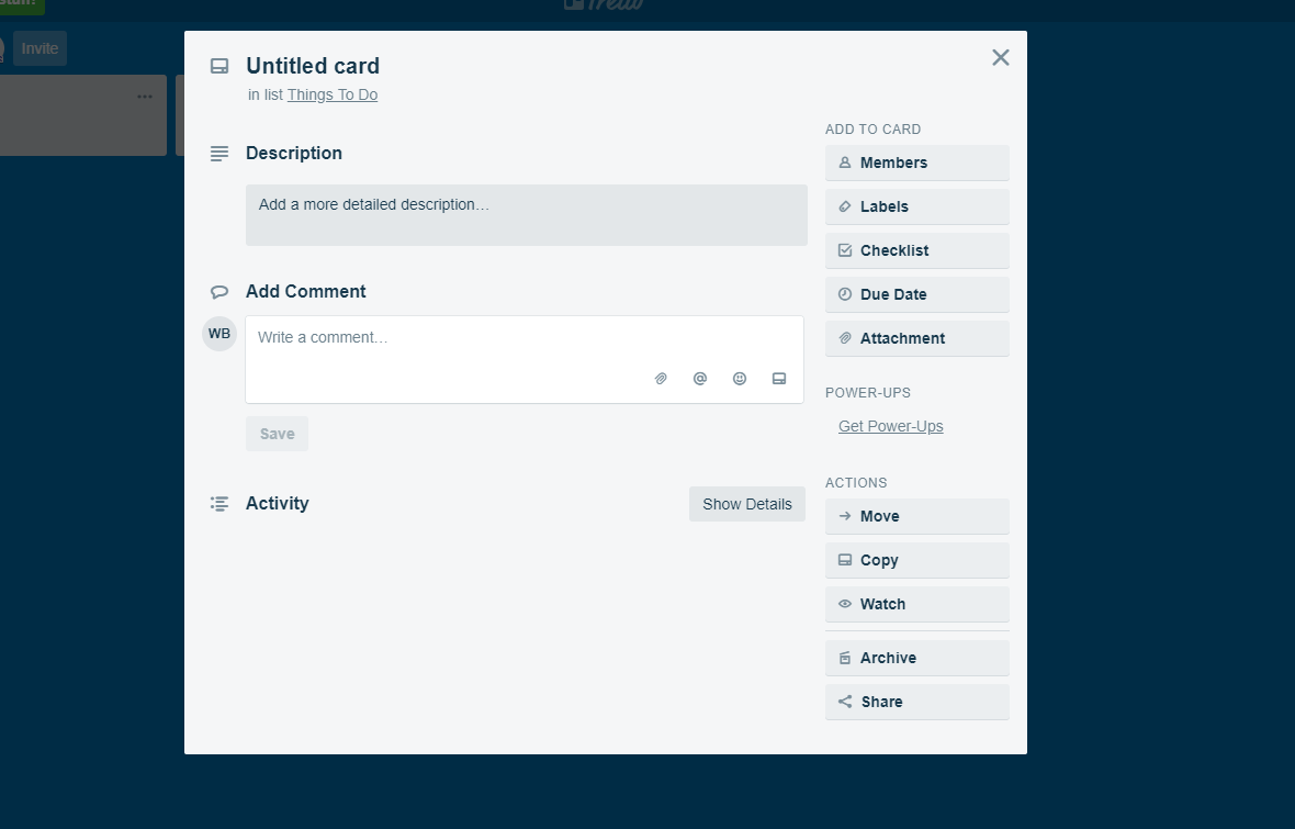
I think we are used to this type of view, so a lightbox would be better (or an option to choose from either).
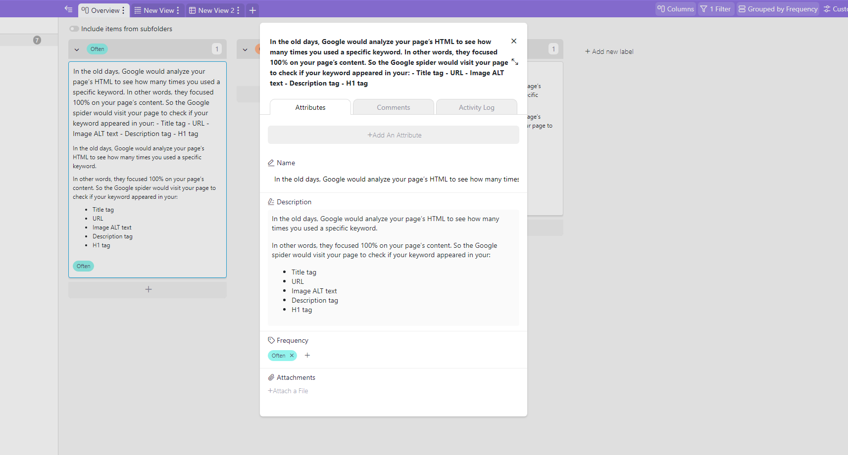
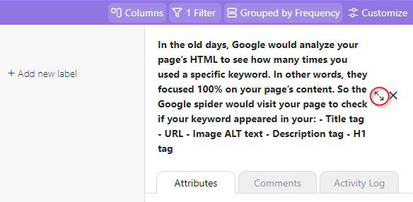
@bloggerkickstart @business When you say lightbox, are you referring to what my first image below is showing? Or are you talking about a preference of how Trello darkens the background out when you select a card?
If the middle of the page popup window is what you’re referring to, you can click on the expand arrows when your task is visible in the sidebar.
Thanks for the info. Much better make it as default. The expand arrow are unnoticeable. It work but I would prefer it expand on click (default) rather have to click again.
Hmm… and I prefer it to be in a sidebar (just like Pages, Numbers show inspector pane in the sidebar)  Personally, I hate it the way it is implemented in Trello

Haha. UI is a tricky thing. It all comes down to user preference. I’m happy as long as we can easily pick and toggle between views.
You already can pick and toggle!
Infinity remembers your last choice and will open the property bar / property lightbox accordingly. So far I don’t need any change to this.
Yup. It’s pretty much a lose lose situation. No matter what you pick as a default view, someone will prefer the other option. Infinity gives us a choice to pick and I’m happy with the way it currently is.