Firstly, i wanted to say that this tool has sooo much potential and i’m really looking forward to using it and following it’s development. Keep up the great work.
I might post multiple suggestions that are similar to this one, because why not?
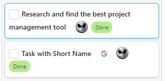
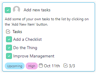
The moment i noticed the Checklist I thought it would be really cool for it to be displayed in the Item itself. See the following screenshot.
Edit: There can also be an option for whether to show it or not.
Just wanted to let you know that something got screwed up when the Name of a task is longer than 1 line.
Also, when you Show/Hide certain attributes even when the field is empty is adds extra spacing. So make sure the padding/margin is disabled when the field is empty.
I also got another idea from all this. What if users could further customize the layout by being able to supply custom spacing/padding/margin values for common things. It could also be per field, when you Edit it.
Edit: Also the checklist counter that was visible at the bottom of the item should probably always be there as long as the item has a checklist on it. It seems to be completely gone right now.
Hey @filipv4 it’s fixed few days ago but it still isn’t live due to deploying process. Sorry about that, it’s going to be live tonight.
Names are bold because they are important, and since you can now see descriptions, checklist and other attributes on items, we need to make name more visible. Can you send me a screenshot how item looks on your end to see if it’s too bolded on your end?
Btw, how do you like the checklist visible on item improvement?
Hey @stefan the boldness is fine, but like i said to Alex in the skype call, it’s good to have options to customize everything. I think it would be really good for Infinity, that aspect of customization.
When it comes to the checklist, i think it can be great. Right now, there’s the spacing issue i mentioned that adds way too much spacing to everything and makes the board more difficult to view. I would really like for everything to be much more compact. Less space between checklist items and fields in general, so that invisible spacing should be removed.
I also noticed that there’s a maximum height to an Item and it would also be nice if we could control that per item as well.
Hey @stefan it seems that while trying to resolve the spacing issue another one has arisen. The Name field should only be able to have other fields before it but not after it. And that’s because you want consistency in the placement of your fields. If the length of the text for the names are different sizes then there’s no consistency to the placing of any of the other fields.
In my case i want the Link, Assigned and Label fields to be bellow the Name, Description etc… always.
So when i asked to have the extra (vertical) spacing removed, that didn’t mean i wanted everything on the same line.
Hi @filipv4 , sorry for the delayed answer. I’m going to try to merge the answer to both your previous questions.
All these things you mentioned are part of UX/UI and I already spoke to the designers and put all your feedback and suggestions in our backlog. I agree with you that UX/UI can be improved and our plan is to work heavily on improving that aspect in the following weeks. So you can definitely expect to see a lot of changes very soon.
Hi @filipv4 I completely understand the problem with no consistency, but it can’t be solved
It’s because you can reorder attributes and have multiple attributes of the same types, so it’s not possible to cover every scenario with 10+ custom fields in all different places.
The only thing we can do to solve this issue is to ‘kill’ customize option for item attributes and make them pre-defined, but we’re going to wait a little bit before making this decision.
At the moment all items are inline. If we make them inline-block, they will go to a next row and take more space…
Everything can be solved with coding and creative solutions. If you’re not able to add additional customization to the Show/Hide Option then just return it to how it was, because this makes it worse…

 We’ll do our best to make something awesome.