The concept of Views / Tabs is working so good for me that I’ve created more than fit on my screen. Though there’s a small arrow that allows me to scroll through the Tabs, there’s no overview over all the Tabs/Views.
Therefore: I would like to have the option to:
have more rows of Tabs / Views
assign a color to a Tab/View
In this way I can group the different views in logical groups e.g.:
tasks/activities
meeting agenda’s / discussion point
project documentation
and will always see all Views available
Right now I work around this by creating different folders (Activities, meeting agenda’s / discussion points , documentation), each with it’s own set of Tabs/Views. However this divides my Cards over separare folders and I don’t want them to be in separate folders.
So basically, Tabs (or Views) are for now working just like in any internet browser. For instance, in Chrome, you can create as many tabs as you’d want, and later scroll left or right to search for the one you need.
I’m not really sure how would an extra row of Tabs work with our current layout. But anyway, I’ve created a ticket in our Suggestion board, and I’ll try to discuss it with our devs.
Combining Tabs/Views with Folders are a great option, that’s basically the core power of our structuring capabilities.
If you want to combine data from multiple folders, I think our ‘Overview’ feature is your best bud. That’s a whole separate ‘Tab/View’ which will allow you to see the data from all the folders.
I have made a mock-up of what I would like to have. Below you see a second row of Tab’s/View. Some of the tabs have a different color (because I want to point out that they have a kind of common purpose). The color does not represent or include any integration on database/automation level. It’s just a intuitive color representing “something”.
The extra row is about being able to see (more) views at a glance, without scrolling to “hidden” views. It’s more intuitive.
Another second solution would be:
Keep the Tabs/Views of the overview always visable, even I the overview is not selected, and have them show the the content of the selected folder (being Overview-selected itself , a selected Folder, or a selected sub folder) See red arrow.
Show on the second row only the Tabs/views that belong to the specific (sub) folder selected. See pink arrow
the mock-up above is again a sample of how this would look like, With the Tabs for the overview already intuitively presented adjacent to the Overview button! (same level)
and the views/tabs for the specifiek folder below it on “folders” level. See pink arrow
this “steels” a row in the interface from the number of rows in the contents table below
but give a whole lot of space for extra tabs/view on the righthand side of the screen. See red ellips.
I totally agree that it is the core power of Infinity!. And therefore, it should get more space! It’s only an extra row in the UI (or 2 extra rows?).
To keep it simple, forget my 2e option to implement this. It’s not intuitive enough. Just add the option to add an extra row per folder.
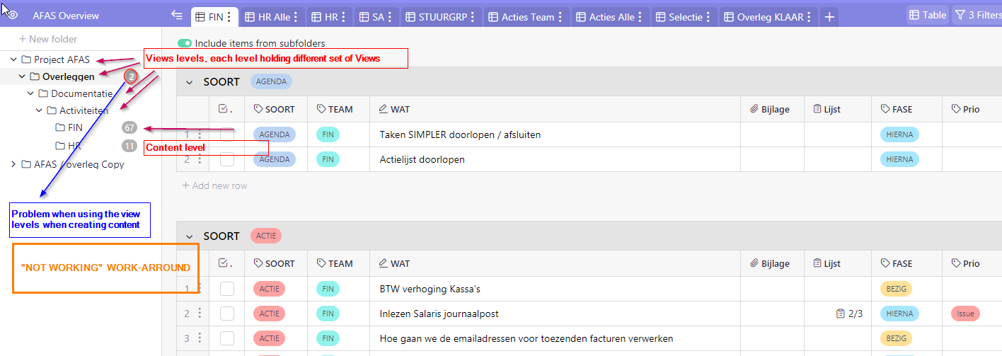
I tried to work around the limitation, by nesting folder, keeping the parent folders empty (no cards in it) and only assigning different views on grandparent, parent folder level with the include childfolders button, to get more views available. But as soon as I add content from a view at parentlevel folder, I create cards in this parent level folder, that I would like to keep empty. Now I must drag them to the appropiate bottom level folder.
Example why above work-around is not a solution: I want to keep all cards in one folder but need more space for views at the folder
So the main problem (or desire is) how to keep all of my cards in one folder and still have all the views I want to use at hand and insight without scrolling! Because imho that indeed is one of the main core strenghts of Infinity
So far for preaching and evangelizing I hope my message will be heard in the brainstorm!


 I hope my message will be heard in the brainstorm!