StartInfinity UI - Please Can You Simplify It!
I’ve finally started making the migration to SI and while it’s got good core functionality, the UI needs some big work to make it easier for new users.
A Quick Few Ideas
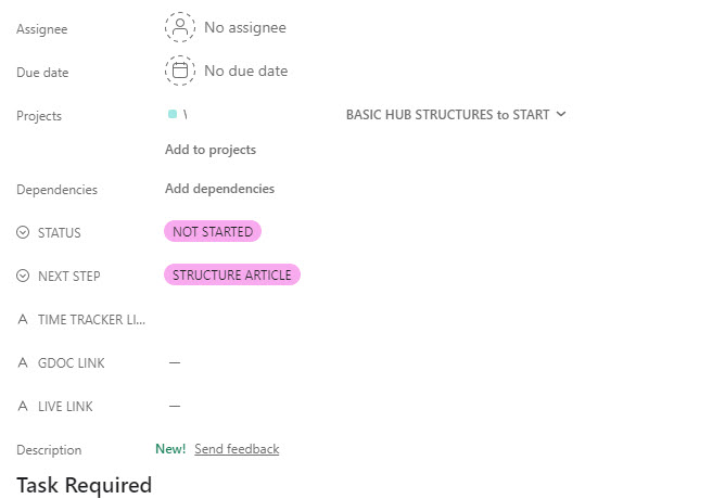
- Option to Hide Attributes on Task Level
(Why must everyone see everything!) - some really are for admins and they just clog everything up! - Hide Attributes on Sub Tasks
- often a sub task is meant to be quick but it’s got a full attribute board clogging up the UI.
- Option to Group Attributes & Put Into Accordion
- again, this would allow you to ‘minimize’ clutter. You could group similar attributes that aren’t often used and have them hidden in an accordion.
- Single Link References - should be on the same line.
i.e. if in ‘link’ attributes you set to single link, it should show the link on the same line not below it. This saves another row. - Remove the Borders on Boxes
- It makes it cluttered as well. I mean if you have a status you don’t need this huge wide box around it. The same applies for the date, when you click on the date it should select it. (I mean just look at what Asana would look like if they added all the borders like you guys add in the attached image)
How are you guys getting around the incredible clutter in SI tasks and boards?
Just look how cluttered this task is for writing an article!
I look forward to really using your tool but am dreading onboarding my team in the clutter of attributes and items they don’t need to see!
I would share more images but you’ve limited new users to 1 image in a post here.
and then if you added all the borders like Infinity does
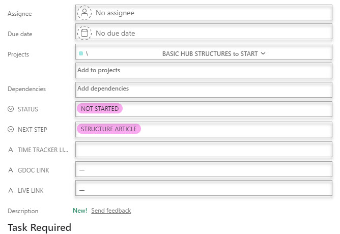
So you can see how busy it makes it!
Just some ideas…