Hi! I’ve been playing with Infinity CSS to check why I think it’s not as “clean” as other tools.
I think Infinity UI should be a bit cleaner. This way all the info would become clearer to check, to read, to edit, to search etc.
Here is my partial CSS suggestion for Infinity
.table-view-item-value {
    border: transparent;
}

.table-view-header .table-view-row-count {
    background: transparent;
}

.flex-compress.hbox {
     background: transparent;
}

.columns-view-group-title .item-count {
    background: #ddd;
    border-radius: 3em;
}

.columns-view-group-title .label-value {
    font-size: 0.9em;
    display: grid;
    text-align: center;

}


.label-value-group-header {
    font-size: 1em;
    padding: 0.5em 0.5em 0.5em 1em;
    border-radius: 1em;
}

.table-view-group-title .item-count {
    border-radius: 3em;
    background: #ddd;
    margin-top: -0.4em;
}


.table-view-header-value[data-v-58def944] {
    border: transparent;
}

.table-view-header .table-view-row-count {
    border: transparent;
}

.columns-view .columns-view-item {
    border-radius: 1em;
    padding: 0.9em 1.2em 0.9em 1.2em;
}

.column-view-item-options {
    padding: 0.5em 0.5em 0 0;
}


/* Table */

.table-view-group-title a {
    display: inline-block;
    margin-bottom: 0.5em;

}

.table-view-group-title .group-header-title {
    margin-top: 0.2em
}

.label-value-group-header {
    padding: 0.5em;
}

.hbox .table-view-group-title {
    background: transparent;
}

.table-view-group-title .item-count {
    padding: 0.3em;
}

.list-view-group-title {
    background: transparent;
}
coa
January 21, 2020, 11:48am
#2
Hey @Tayshiro !
Wow! Thank you very much for taking the time to research this and get a more detailed look.
I’m going to forward this immediately to our dev team and see what do they have to say about this
3 Likes
man
January 21, 2020, 2:18pm
#3
I’m not exactly sure how @Tayshiro 's css looks like (yeah, I’m bad at css
3 Likes
I think that too. A cleaner design is always great
To check my code, install the CSS Magic extension on Chrome and paste the code there. You will see the changes in your views without having to change the app itself
1 Like
man
January 21, 2020, 5:20pm
#5
I really like it.
Although I’m more of a fan of shadows and square borders, I do like the cleaner interface and more accent area (column titles). Great job @Tayshiro !
2 Likes
I gathered some examples. I know UI it’s not a priority right now, but it’s always nice to have good references.
They are completely different from Infinity, but Clickup, Notion.so and Coda, in their own way, created a solid UI identity that eases the tool use. This is why I’m suggesting and pasting reference links.
2 Likes
Hey, @man ! I’ve just updated to a new font, to make it looks better with the CSS I edited. Although it becomes heavier to load, I think it gets more pleasant to see.
@import url(//fonts.googleapis.com/css?family=Quicksand);
body {
  font-family: 'Quicksand', sans-serif;
}

.table-view-item-value {
    border: transparent;
}

.table-view-header .table-view-row-count {
    background: transparent;
}

.flex-compress.hbox {
    background: transparent;
    text-transform: uppercase;
}

.columns-view-group-title .item-count {
    background: #ddd;
    border-radius: 3em;
}

.columns-view-group-title .label-value {
    font-size: 0.9em;
    display: grid;
    text-align: center;
    color: #444;
    font-weight: 800;
}

.label-value-group-header {
    font-size: 1em;
    padding: 0.5em 0.5em 0.5em 1em;
    border-radius: 1em;
}

.table-view-group-title .item-count {
    border-radius: 3em;
    background: #ddd;
    margin-top: -0.4em;
}

.table-view-header-value[data-v-58def944] {
    border: transparent;
}

.table-view-header .table-view-row-count {
    border: transparent;
}

.columns-view .columns-view-item {
    border-radius: 0.5em;
    padding: 1.5em 1.2em 0.9em;
}

.column-view-item-options {
    padding: 0.5em 0.5em 0 0;
}

.flex-auto.scrollable {
    padding: 0 0 0 0.5em;
}

.table-view-group-title a {
    display: inline-block;
    margin-bottom: 0.5em;

}

.table-view-group-title .group-header-title {
    margin-top: 0.2em;
}

.label-value-group-header {
    padding: 0.5em;
}

.hbox .table-view-group-title {
    background: transparent;
}

.table-view-group-title .item-count {
    padding: 0.3em;
}

.list-view-group-title {
    background: transparent;
}

element.style {}
<style> .flex-auto.scrollable {
    padding: 0 0 0 0.5em;
}
.columns-view-item-group {
    min-height: 55px;
    margin: 6px 0;
}
.scrollable {
    overflow-y: auto;
    overflow-x: hidden;
    -webkit-overflow-scrolling: touch;
}
.flex-auto {
    flex: auto;
}
.scrollable::-webkit-scrollbar {
    width: 8px;
    height: 0;
}

.columns-view-item .text-value {
    font-size: 1em;
    font-weight: 700;
    color: #444;
}
.scrollable::-webkit-scrollbar-track {
    background: rgba(0,0,0,0) !important;
    /* manage scrollbar thumb background color here*/
}

.columns-view-column .flex-auto.content-center {
    border-bottom: 3px solid rgba(0,0,0,0.04);
    margin-bottom: -3px;
}

.table-view-header {
    border-top-left-radius: 1em;
    border-top-right-radius: 1em;
}

.label-value-items .label-value {
    color: #444;
    font-weight: 600;
}
2 Likes
coa
January 22, 2020, 11:35am
#8
@Tayshiro Looks amazing!
Thank you very much. We might as well play around with this.
3 Likes
man
January 22, 2020, 11:50am
#9
I like the first and third the best, I like to have UI when key info or tasks are highlighted and get the most “accent”
I play atound with the updated css later and let you know my feelings
2 Likes
Gnarza
January 23, 2020, 8:19am
#10
@Tayshiro great work! I really prefer your styling compared to the current. I hate when you group by a label that it says the label name huge instead of the actual labels but your version fixed that.
4 Likes
Thanks! I just changed a few things, but It’s far from ideal.
2 Likes
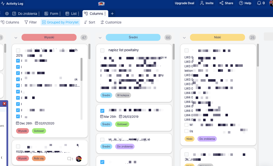
 so you can check and Understand what I was trying to achieve!
 ) but I do thing that I like design of Infinity homepage/sales pages, etcmuch better than the UI of the app itself. But that’s just a general impression and I’m not able to tell you why exactly I feel this way