Hi again!
There is an old topic with a lot of discussion about whether comments should or should not come first. But my suggestion is only an UI design suggestion, so I didn’t continue on that thread.
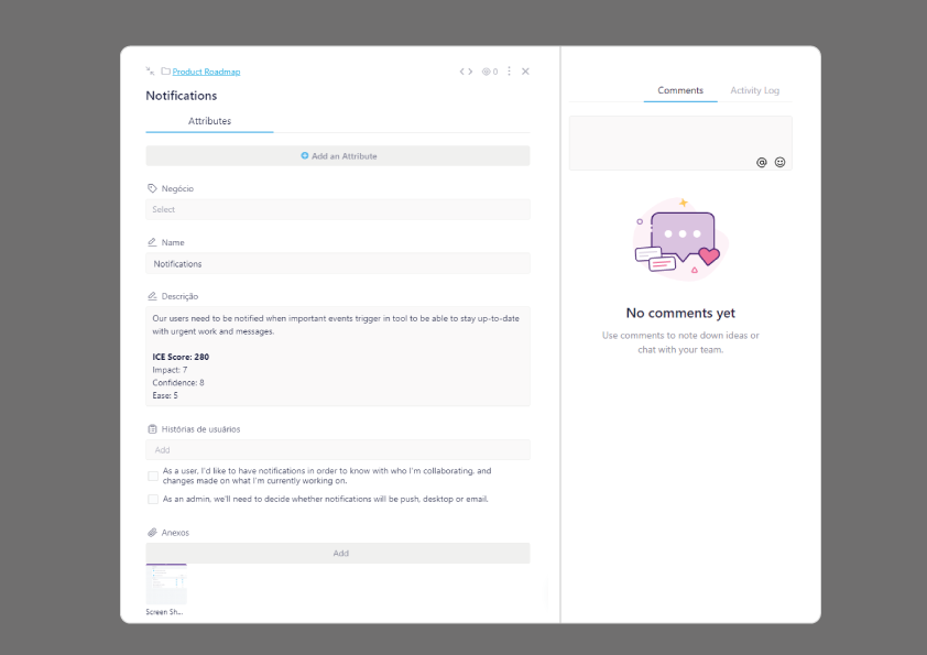
As a (almost former) Clickup user and a former Pipefy User, I have a suggestion on how to layout the comment tab.
As an User, I see the layout by priority:
1st - Task atributes (we need to see what we have first)
2nd - Communication, for team players, having a comment window at hand is really useful
3rd - Log Activity - This item seems to me only for consulting, so It can remain hidden.
Please check the fake UI I modified so you could see my suggestion.
This way, it can remain responsive and for bigger screens, it is still organized. =)
