Board Background Images

So this is a longstanding feature request of mine,

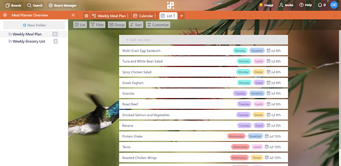
I just got tired of the default look, having moved over from Trello and I have missed the ability to change backgrounds, but I decided to do something about it. Using a chrome extension called stylus and a little digging into the CSS.

Maybe it could be one of the infinity coders weekend projects to implement some options like this.

I am calling it Infinity Hummingbird :grinning:


Anyone can take it to use it and mod it, I just hope something like this will come into Infinity.

Have fun Folks!

I am not an expert at CSS, I just googled a lot of commands and ended up with this, so I am sure someone can write it better and cleaner.
Here’s the CSS, stick it in your browser and play around with it.

/* columns */
div.vbox.columns-view-column.full-height.draggable-item
.group-container {
width: 220px;
border: thin solid #eee;
background-color: #f9f9f9d4!important;
}
.columns-view .columns-view-item {
margin: 0 5px 8px!important;
}
.columns-view-column {
margin-right: -15px!important;
}

/* BOARD BACKGROUND IMAGE */

.scrollable-x {
background-size: 100% 100%;
background-image: url(‘https://images.unsplash.com/photo-1561108794-7d40db914129?ixlib=rb-1.2.1&ixid=eyJhcHBfaWQiOjEyMDd9&auto=format&fit=crop&w=600&q=60’);
background-attachment: fixed;
}

/* TAB OPTIONS BAR - BACKGROUND */

.view-options.folder-actions.hbox {
background-size: 100% 100%;
background-image: url(‘https://images.unsplash.com/photo-1561108794-7d40db914129?ixlib=rb-1.2.1&ixid=eyJhcHBfaWQiOjEyMDd9&auto=format&fit=crop&w=600&q=60’);
border: none;
background-attachment: fixed;
-webkit-filter: hue-rotate(60deg) brightness(90%) grayscale(100%);
filter: hue-rotate(10deg) brightness(80%) grayscale(10%);
}

/* TAB OPTIONS BAR… Button Background */
.view-options .overview-alert .checkbox-switch-label span {
color: #ffffff;
}
.view-options.folder-actions.hbox .context-menu-toggle {
background-color: rgba(255, 255, 255, 0.91);
}
div.vbox.columns-view-column.full-height.draggable-item {max-width:250px;}

/* TOP TWO BARS… */
div.navigation.hbox {background-size: 100% 100%;
background-image: url(‘https://images.unsplash.com/photo-1561108794-7d40db914129?ixlib=rb-1.2.1&ixid=eyJhcHBfaWQiOjEyMDd9&auto=format&fit=crop&w=600&q=60’);
border: none;
background-attachment: fixed;
-webkit-filter: hue-rotate(60deg) brightness(90%) grayscale(100%);
Filter: hue-rotate(
334deg
);
}
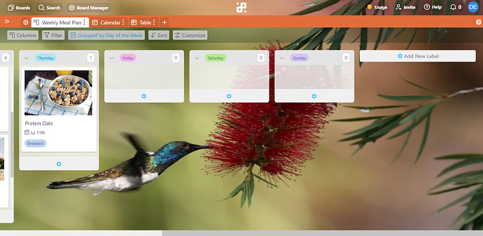
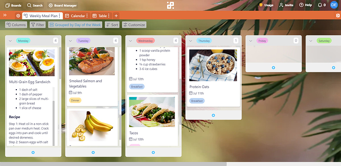
Wow, this looks amazing. So much more mature. Thanks for putting in the work!
Hopefully infinity will implement this quickly.

1 Like

WOW - definitely impressed with your efforts here!!! AMAZING - I too would LOVE this feature so I cast my vote too! Thanks for your proactivity!

1 Like

That’s quite impressive @Derrick! Thank you for taking the time to create this and share it with the community. :slight_smile:

1 Like

I was shocked at first that there is no way to change the background in Infinity, at least the colors! Not having a dark mode in 2021 is definitely super retro!

Hi @saneofficial :wave:

You can most certainly use some of the extensions available in the google chrome extension place, but they do not cover all the aspects of infinity, or just simply don’t work at all. Non of those extensions are supported or developed by us.

As the night mode / dark mode has been suggested so many times in the past couple of weeks, we’ll make sure to increase its importance and potentially get started working on it sooner!

:v:

I got excellent and consistent results using Dark Reader on Infinity. In fact I use it on every website:

https://chrome.google.com/webstore/detail/dark-reader/eimadpbcbfnmbkopoojfekhnkhdbieeh/related?hl=en-US

I do agree with @chrish on this one, the Dark Reader is worth experimenting with.

I have used it before myself and I did notice that it eliminates some essential colors (label colors for example), but you can probably play with the settings and get the desired look.

Just a heads-up. In my experience using Dark Reader with Infinity, using these settings allows the labels colors to show:

Under “Theme for all websites”

Brightness - 150%
Contrast 97%
Scheme - Dark
Mode - Filter+

You can adjust all of these. In particular you may want to use more or less Contrast and/or Brightness. I just use 150% and 97% because I prefer the background blacked out and the colors bright so they pop.

In any case these are the settings I’ve found that display labels with their light or dark fonts beautifully.

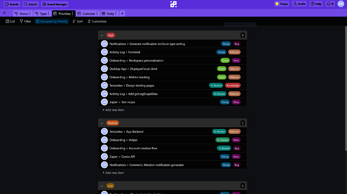
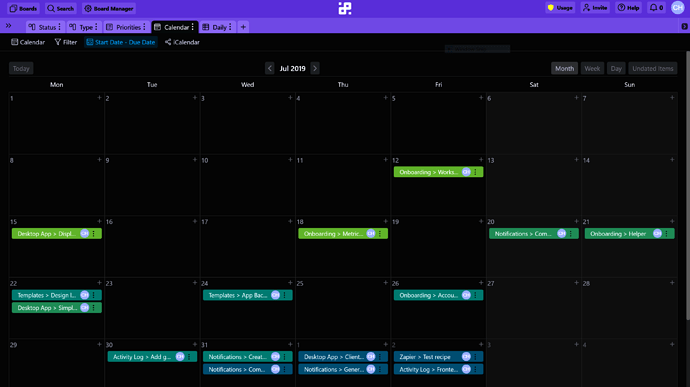
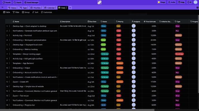
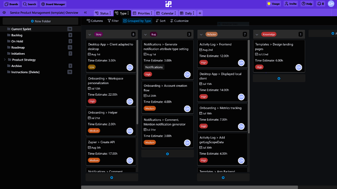
Here are screenshots of Infinity’s Service Product Management Template using these settings.

![Service%20Product%20Management%20-%20Type|690x387]

(upload://7DNrEWmjmHMYfrrKYxWNVSbPfhS.png)

I hope this helps other users as much as it’s helped me. I spend so many hours looking at the screen of my laptop. Unless there were absolutely no other choice, there’s no way my eyes, brain, or attention span could stand looking at a bright or dull white screen for so long.

2 Likes

Looks like this got a little off topic, I’d like to +1 the feature request for background images. Makes it feel more alive.

Maybe you don’t want to handle uploading images, so could just make v1 allow us to pop in a url to an image or select one from unsplash.

Our team also had a thing on trello where every week a different team member chose the background image. Made it a little fun and interesting.

1 Like

Hey @jordie thank you for joining in, we are happy to see you around :partying_face: :wave:

Thank you for voting and for your suggestion, URL seems simple and something that would be much easier to implement. I’ll add it to our internal ticket as well. :clap:

Thank you :pray:

Jordie I love your idea of different team members choosing a picture.
It reminds me of Fun Theory https://youtu.be/2lXh2n0aPyw It’s also why google offices are so fun.
Make something fun and you can get people productive.

I know that we are all different! That is what makes us so beautiful. I wish I could explain why having a background color helps me- I can’t explain it. But without a background or the all black- it is too many words.

Please help us be able to add backgrounds.

Jennifer

1 Like

@jennifertracy.me, You can use the Dark Reader extension if in the absence of other background colors you’re willing to use a dark or black background. I’ve been using it for years on about 98% of websites, and successfully using it on Chrome with Infinity since the beginning. It’s also available for Firefox, Safari and Edge browsers.

Here’s the link: https://darkreader.org/

I’ve only used it with Chrome and it’s a little tricky to get the settings just right so that all the elements display. So if you’re using Chrome and need some suggestions on how to adjust the settings, let me know.