if you use the infinity iPad app at split screen sharing the screen with another app, but you get the infinity app 75% of the screen width while in landscape, it’s the same as if you have just been through the app open with no split screen but the tablet is vertical.
When this is happening, the infinity app is 70 formatted like the phone version, with reduced functionality and reduce the views, even though with the tablet in landscape mode and the infinity app taking up 75% of the screen with, it has just as much real estate as the app does when it’s taking up the whole screen but the tablet is vertical. So the app should still be fully functional when it is 50% screen with or more in landscape mode.
Thank you for all the detailed explanation of what is happening. I believe, actually, I know - that is due to the super optimization the app is designed with, which can be annoying sometimes for some users, depending on the usecase.
I will talk with the team about this, to potentially see if this can be optimized differently in order to create a much better experiencing when using multiple apps or multitasking with the iPad.
I am curious, have you tried to use infinity app through the browser, and force it to load it as a “desktop version”. Depending on the browser it might give you the chance to load it as 'desktop site", open with “desktop view” and similar. It might not work again - due to the size of the “window” / “screen”, but I would give it a try.
The problem is it is not a true desktop view as the @media breakpoints are set
for responsive, which looks like it is set at 50%.
This is my experience on desktop, so not exactly the same is related.
Although responsive views may work great for mobile it is not great for anything else. On desktop for example when working on more than one board at the same time (tiled) it is not possible to see columns in desktop mode unless zooming out so far you cant see the page anymore. I have struggled with this for ages and am not surprised that someone with a an Ipad which is essentially a mobile device is also.
Nowadays with mobile we don’t really need to save bandwidth anymore as most people have plenty of data or are on Wifi, or as in the case of the above poster wants a desktop like experience on a mobile device.
The problem with the mobile view is it is essentially cutdown, its missing the cards in column view and all the display settings, all the images that one can set to see at a glance.
On a desktop, basically we need the same desktop experience whether it is in a full window a split window or a sidebar.
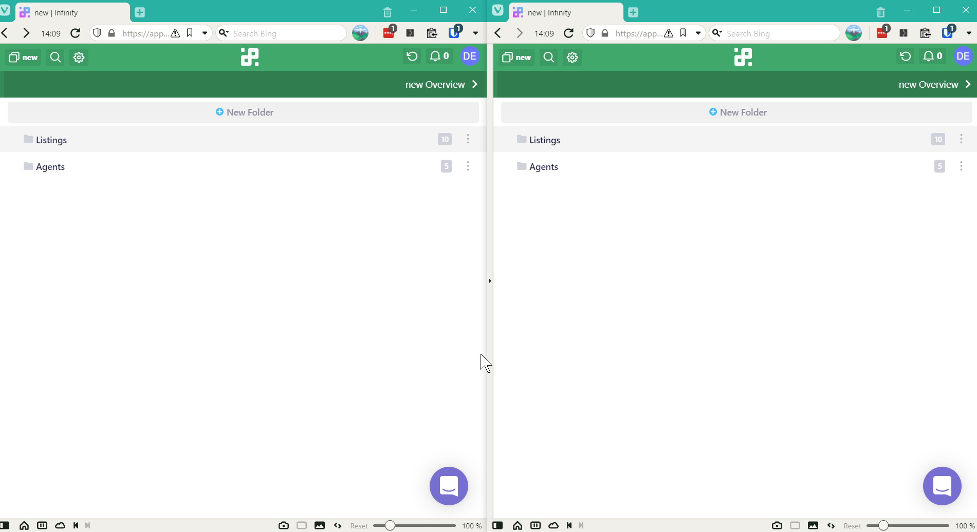
I could have demonstrated the above videos using two windows snapped side by side in win10 and it would show 2 mobile views. ( see image below)
This is not good enough in my opinion
I am sure Infinity could come up with a better, solution.
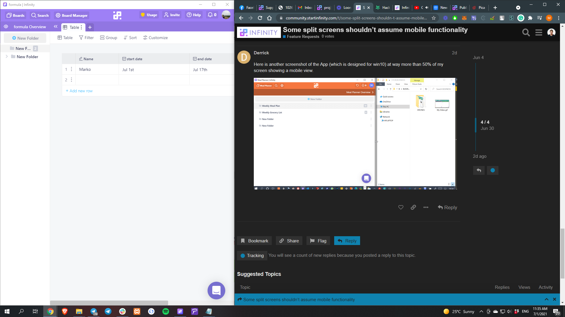
Here is what happens with the same board in trello and Infinity.
In Trello we can still see the cards in a sidebar type view, where as you cant with Infinity.
I’d love to know how I can target the css to fix this myself ie: cancel the @media instructions, because that’s all that really needs doing from my perspective, probably a few lines of code, to a show a true desktop view that is not responsive. but I have never figured it out, if anyone knows please tell.
Thank you so much for the detailed explanation once again, I completely understand what you mean, I have to admit - it’s not the first time I hear something like this, as people would like to multitask and use more than one app at the time. When they / you lower the size of the window (at some point) it switches to the “mobile” version due to hard optimization that was implemented.
On my side, with my 1920*1080 resolution on a 24" display, I can say that app turns to mobile “mode” much later, I would say probably when the other app is set to 60% of the screen and infinity remains at 40% or less.
Regarding the CSS question you forwarded to everyone else, I know that there are css extensions (in google chrome) that can help you edit/change css code and save them for that specific website - but I wouldn’t be able to tell you exactly where to look at in the code and how to edit it. (here’s where I read about that CSS editor and where one of our users set-up background images for his boards and similar )
Of course, I’ll forward everything you mentioned to our team and we’ll see if other app related reports and this specific optimization one will be something that can be redesigned/reworked/changed/fixed in the future.