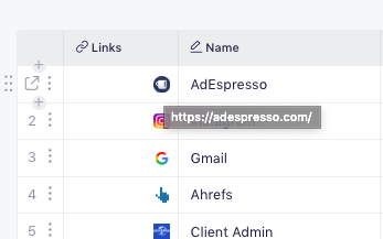
The URL field displays each URL as a small fav.ico.
Is there any way to just have it display the URL? I find it quite irritating to not see the URL itself displayed.
Here’s a request I posted that relates to your request. It concerns to how links URLs display in table view:
Hey @scholvien,
If you hover your mouse over the favicon, the URL should display.

We’re going to improve this feature, of course. 
Thanks.
It i snot a bad idea to show the favicon. A lot of sites do not have one though, so its a lot of grey boxes in some tables. favicon + URL display would be good. I mean, not on hover but just displaying it directly. Anyways, noted tht you guys are still working in this.
By the way I noted one thing. Imported boards that were imported from csv do not show a favicon in the link field, even when they have one. They need to be saved again in same field and then it is populated. Not sure that is expected behavior.
After using this for a while I do have to say though that it is very useful to be able to put several links into one cell. Makes some of my tables much more organized.
Please make default display of URLs plain text (perhaps with the favicon in front). And please don’t truncate URLs.
Hey there @linuslorentzen ![]()
Welcome to the community we are glad to see you here ![]()
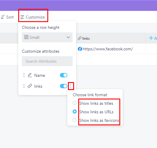
You can change how your link is displayed by using our customize button. You can decide to see a favicon + link as well, here’s where you can find those options:
Hope that helps ![]()
Hi Marko
Thanks for your replay.
I’m very well aware of these features, and I’m constantly ‘forced’ to use the ‘customize’ settings.
I would prefer more options AND that the default was a plain link text (like if you add a link to a spreadsheet or other regular text document.) Alternatively an option to save my own default setting.
And showing the link but cutting off the end (truncating it) is in my opinion absurd.
You can also pull in the title from the page. A page title tends to be quite descriptive and opposite the raw URL, they often have the most informative part in the beginning.
Thank you for your feedback @linuslorentzen, we most certainly appreciate it.
It is more of a visual thing, but I understand how annoying it can be:

You can most certainly click on it, then you can click on copy in order to get an entire link and use it, but again - that is probably not the point here.
The only other way to see the entire link would be to use our long text attribute and paste in the entire link:
I'll make sure to forward it all to our team (add additional importance to the tickets we already have) and hopefully we'll be able to see some improvements regarding details and options like this. :v:

